Author Archives: Himanshu Sharma - Page 5
In this article, we will explore Folium, a python library which is used to create different types of geographical data visualizations. We will try and create different types of maps and markers on maps.
The post Hands-on Tutorial On Folium, Python Library For Geographical Data Visualization appeared first on Analytics India Magazine.
Widgets are the part of a GUI that allows the user to interface with the application. Widgets can make our jupyter notebook look lively and interactive. Widgets are elements like buttons, drop-down list, slider, etc. Widgets allow users to interact with the notebook, manipulate output according to the selection of widget and controlling events. It…
The post A Complete Guide To Ipywidget – Interactive HTML Widgets For Jupyter Notebook appeared first on Analytics India Magazine.
Dashboards are collections of bars, charts, and graphs that help us visualize different attributes of a dataset. A dashboard works as a graphical user interface which helps us identify the key performance indicators relevant to the dataset or the particular business model. Python provides different open-source libraries that can help you create your own dashboard…
The post Hands-On Tutorial on Bokeh – Open Source Python Library For Interactive Visualizations appeared first on Analytics India Magazine.
In this article, we will explore what all we can do using DataPrep with using its features.
The post Tutorial For DataPrep – A Python Library to Prepare Your Data Before Training appeared first on Analytics India Magazine.
Analysing the dataset helps us in identifying the data and its attributes, and address anomalies in the dataset, find out whether the data is clean or not, if it is following any particular pattern or not and so on. Cleaning the data is a necessary step in which we clean the data according to certain…
The post Hands-on Tutorial On QuickDA For Data Analysis and Cleaning appeared first on Analytics India Magazine.
To overcome these drawbacks of Pandas, let us explore a high-performance python library for lazy Out-of-Core Dataframes named Vaex which is used to visualize and manipulate big tabular datasets.
The post Hands-On Guide to Vaex – Tool to Overcome Drawbacks of Pandas appeared first on Analytics India Magazine.
DTale is a Graphical Interface where we can select the data we want to analyze and how to analyze using different graphs and plots.
The post Dtale Tutorial – Guide To Visualize Pandas Data Structure appeared first on Analytics India Magazine.


Faker is an open-source python library that allows you to create your own dataset i.e you can generate random data with random attributes like name, age, location, etc. It supports all major locations and languages which is beneficial for generating data based on locality.
The post Faker Tutorial, A Python Library To Create Your Own Dataset appeared first on Analytics India Magazine.


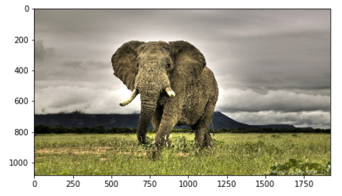
Image Feature Extraction Using Scikit Image - A hands on tutorial on handling and analyzing images using skimage in Python
The post Image Feature Extraction Using Scikit Image – A Hands-On Guide appeared first on Analytics India Magazine.

